A New Era for A1
A1 Telekom Austria Group is a leading provider of digital services and communication solutions in Central and Eastern Europe serving around 27 million customers under the brand name ‘A1’.
After launching in 7 countries over 4 years ago, A1 needed to refresh its brand design to support its evolving business and strategy. The brand design language had to respond to country specific audiences, different communication channels and also be optimised for the evolving digital and physical channels.
The rich tapestry of cultures and traditions influenced diverse design approaches, resulting in inconsistencies. Lacking proper branding guidelines and tools, different countries introduced variations, encompassing different languages, alphabets, and unique brand requirements.
To help guide the different design teams, advertisement agencies and content producers, a ‘Design Ethos’ was developed to articulate the spirit and personality of the design language, to open the doors to creative thinking, getting away from a dogmatic closed corporate design system.
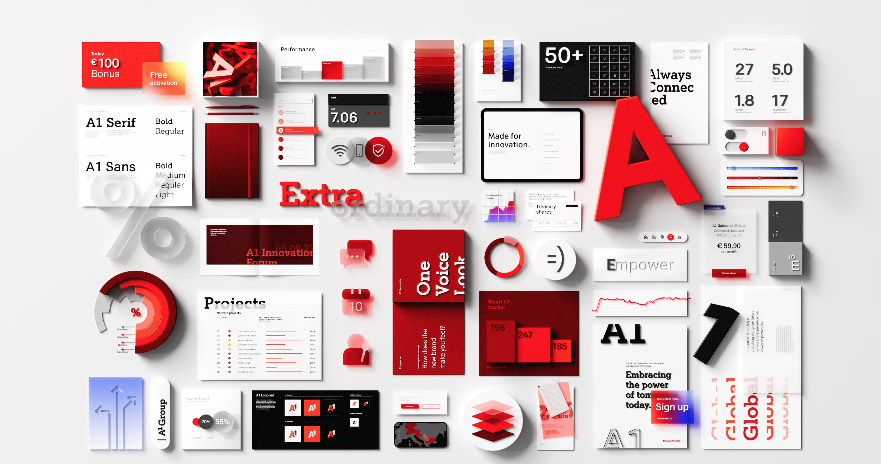
The design reboot includes a digitally optimised logo, a new icon system, colour scheme, type behaviour, art direction and more digitally native and functional elements.
The A1 project holds a special place in my heart, reflecting my deep passion for design, as branding is communication which is the central theme in my life and most of my work.
I was given the opportunity to travel to the countries involved, engaging with the people, studying and analyzing their patterns, psychology, and language for design. We conducted workshops on brand usage, and seeing people happy and excited about the work was incredibly fulfilling. This, to me, is a testament to the power of effective communication through design.

The Challenge:
Loss of visual identity
As A1 expanded into 7 distinct countries, challenges arose as the A1 brand began to lose its unique identity.
In response to diverse needs, some countries took unconventional approaches, creating visual chaos.
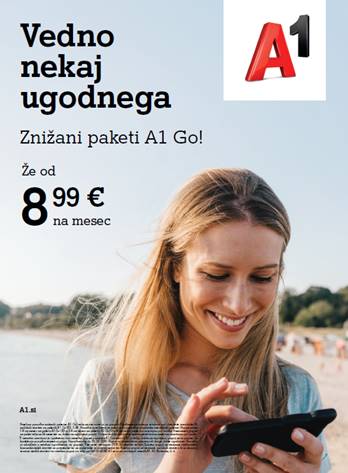
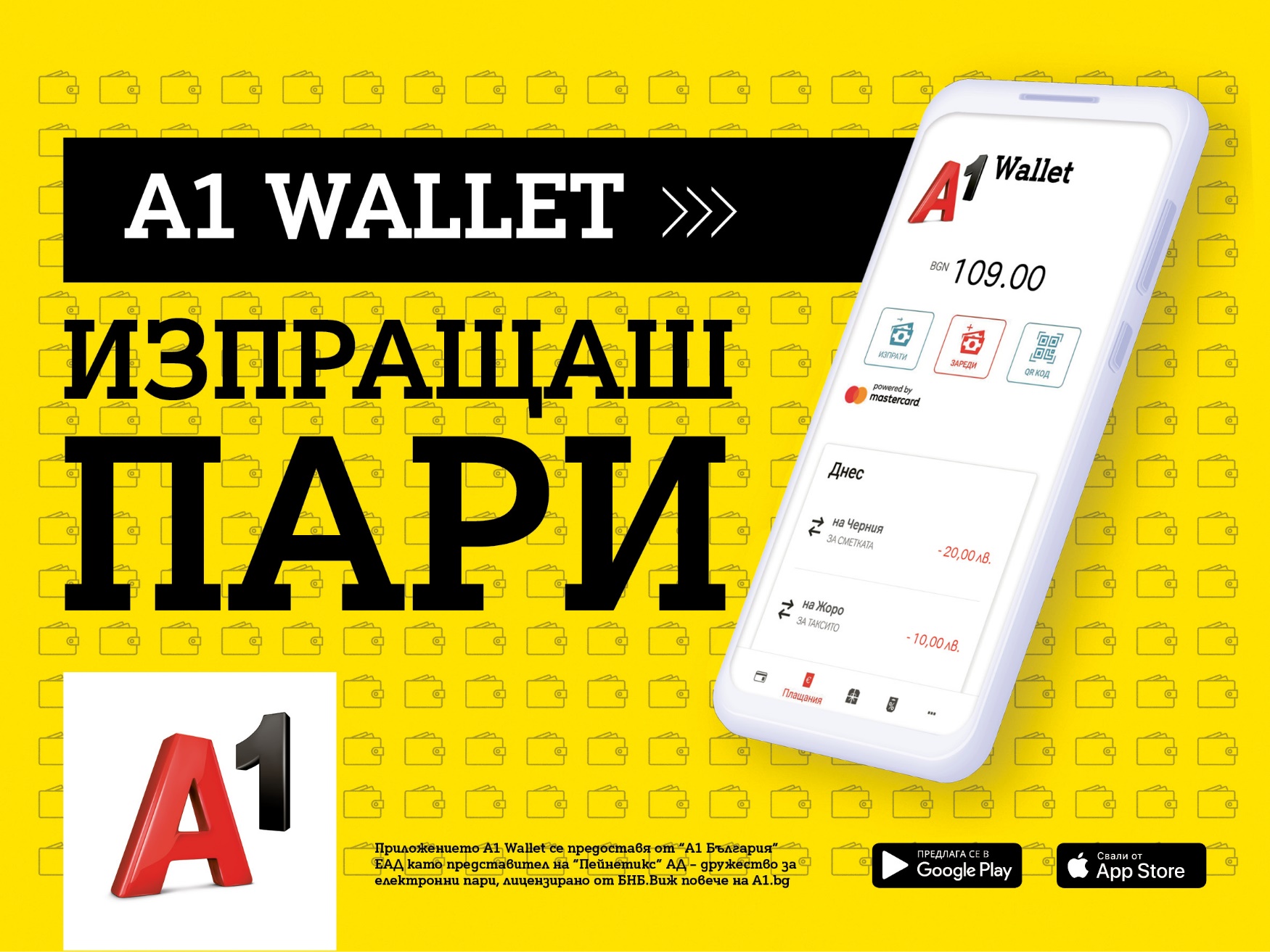
E.g: Bulgaria introduced yellow without a clear rationale. The lack of a unified language or guidelines led to inventive, sometimes chaotic solutions. This marked a departure from a cohesive visual identity, creating a brand with a split personality.
Despite A1 being a single brand, the varied needs of different countries, distinct brand positions, languages, and cultures led to different visual expressions.
A1, as a collective entity, lacked cohesion and unity, unready for the diversity it faced, leading to the absence of a unified identity.
In response to diverse needs, some countries took unconventional approaches, creating visual chaos.
E.g: Bulgaria introduced yellow without a clear rationale. The lack of a unified language or guidelines led to inventive, sometimes chaotic solutions. This marked a departure from a cohesive visual identity, creating a brand with a split personality.
Despite A1 being a single brand, the varied needs of different countries, distinct brand positions, languages, and cultures led to different visual expressions.
A1, as a collective entity, lacked cohesion and unity, unready for the diversity it faced, leading to the absence of a unified identity.
 .
.  .
.  . .
. . We encountered a fundamental issue where A1 was primarily centered around its logo.
Despite the logo's dynamic features, it became a diminished element in everyday applications, consistently placed on a white background atop commercial elements. Consequently, the overall brand lost its initial excitement, feeling devoid of identity and appearing flat. The essence of the brand seemed to fade amid commercial and commonplace elements, raising concerns about its presence.
The brand lacked flexibility.
Solution
A “Design Ethos" was developed to serve as a guide for creative teams, regardless of their location or the nature of their work. Its purpose is to empower content creation with a sense of freedom while adapting the visual style to resonate with specific audiences. This Ethos is designed to align with the corporate mission while instilling tangible characteristics that stimulate the creative process.
This guiding principle nurtures a creative process that embodies the essence of design, promoting user experiences that forge authentic connections while prioritizing simplicity, functionality and flexibility.
This guiding principle nurtures a creative process that embodies the essence of design, promoting user experiences that forge authentic connections while prioritizing simplicity, functionality and flexibility.
Owning the 3D space
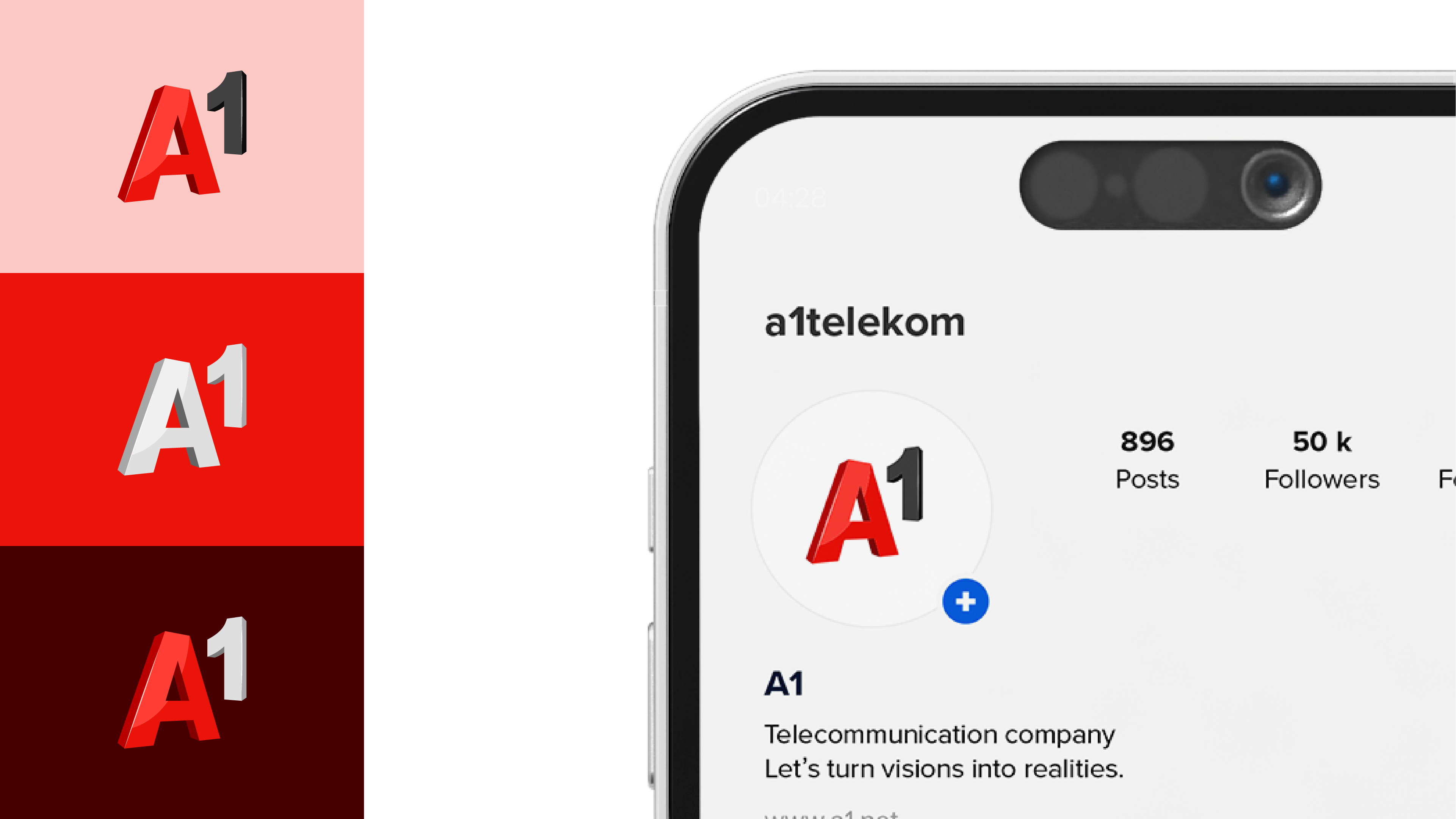
We began working on the logo by eliminating the shutter and shadow elements. We also reoriented the logo's perspective to imbue it with a dynamic and lively quality. This adjustment provided us with increased flexibility and excitement, allowing the design to break free from constraints.
The A1 logo has always been unique but its true characteristic is its dimensional aspect. The logo needed to perform in a wider variety of spaces by developing an optimised version designed for digital environments, discarding the white container and creating new versions meant the logo could now behave in a more adventurous way. This evolution injected newfound boldness into the logo, new visual behavior, celebrating its 3D shape, materiality, and motion qualities.
The A1 logo has always been unique but its true characteristic is its dimensional aspect. The logo needed to perform in a wider variety of spaces by developing an optimised version designed for digital environments, discarding the white container and creating new versions meant the logo could now behave in a more adventurous way. This evolution injected newfound boldness into the logo, new visual behavior, celebrating its 3D shape, materiality, and motion qualities.
Colour
Evolving a single monotonous and limited red colour palette, a new range of reds was introduced to celebrate all the tones that exist in the logo. Added to this basic palette was a range of accent colours that give variety and usability to the digital environment and a richer, more lively visual language for communications.
Within this system, we introduced an additional palette with gradients and other elements, allowing for the inclusion of colors beyond red.
Within this system, we introduced an additional palette with gradients and other elements, allowing for the inclusion of colors beyond red.
Typography
Type and headline styles underwent a complete overhaul, offering creative liberty within the design system. Although the iconic A1 font possessed distinctiveness, its versatility had been limited. A new outline variation of the typeface was developed, and roles were reassigned to A1 Sans and Serif fonts. This transformation enabled greater responsiveness to the brand's evolving needs.
Iconography
In line with the evolution of the design system to respond to a more digital environment, icons were developed to work at the smallest possible pixel dimensions but equally to work as animated communication elements to illustrate concepts and messages.
Digital
The brief required a fundamental change in the way the brand personality was expressed in digital touchpoint. The dimensionality, materiality and colour palette pushed the UI elements to a totally new space for the brand, unlocking the potential for the digital teams to generate a new kind of experience for A1.
Visual Language
The whole visual brand language was built on the
‘Design Ethos’ where relevance to audiences and performance are more important than consistency. The recognition of the brand is driven not by the systemisation but the behaviour, personality and attitude. With new art direction the imagery and illustrations complement the icons, typography and colour to speak a new design language for A1.
‘Design Ethos’ where relevance to audiences and performance are more important than consistency. The recognition of the brand is driven not by the systemisation but the behaviour, personality and attitude. With new art direction the imagery and illustrations complement the icons, typography and colour to speak a new design language for A1.
Credits & details
Location
Agency
Designer
Agency
Designer
Madrid, Spain
Saffron Brand Consultants
Constanza Pinto
Saffron Brand Consultants
Constanza Pinto